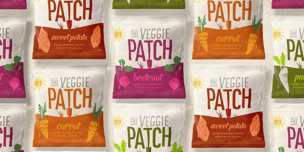
The brand identity for Ingham, a company focusing on healthy frozen food alternatives, has taken on a cleaner, more fresh aesthetic to embrace this mission. Yet more than this, the designers behind the new look wanted to inject more life into the brand in general. They share, "The existing Ingham range was lacking excitement and failed to engage consumers at point of purchase."
Redesigned by Jam&Co Design Pty Ltd, the Ingham food packaging is meant to appeal to today's health conscious consumer through a modern aesthetic that is full of white space and great photography. With playful typography and smart descriptions, the Ingham brand now stands out from the crowd. The designers write, "The result was a big win for Ingham, reinstating them as a trusted, innovative brand within a highly competitive market."
Key Themes Behind This Trend
- Clean and Healthy Brand Identity
- Disruptive innovation opportunity: Develop packaging designs that emphasize cleanliness and healthiness to appeal to the health-conscious consumer.
- Modern Aesthetic
- Disruptive innovation opportunity: Create packaging designs with a sleek and modern aesthetic, utilizing white space and high-quality photography to stand out in a crowded market.
- Playful Typography and Descriptions
- Disruptive innovation opportunity: Incorporate playful typography and smart descriptions in packaging designs to effectively engage consumers and differentiate from competitors.
Where This Applies
- Frozen Food Packaging
- Disruptive innovation opportunity: Explore innovative packaging solutions for frozen food products that align with changing consumer preferences for health and freshness.
- Food Packaging Design
- Disruptive innovation opportunity: Redesign food packaging across various categories to incorporate clean and modern aesthetics, enhancing consumer appeal and brand perception.
- Competitive Consumer Goods Market
- Disruptive innovation opportunity: Develop innovative packaging strategies to help consumer goods brands stand out in highly competitive markets and drive sales.