
The Indian election—which is drawing to a close—represents the largest democratic exercise in human history, with more than 550 million votes being cast in a mammoth election conducted over nine phases spread out over five weeks.
The vastness of India’s populace and the sheer scale of its democratic machinery means that its electoral system is rather difficult to explain and understand. However, the Al Jazeera English news station managed to put together this excellent, elegant infographic that breaks down how the Indian elections work.
The infographic, which was released before voting began, explains the difference between India’s two houses of parliament. It breaks down how voters go about electing their representatives, and how the executive head of the government—the Prime Minister—comes to power. It also provides statistics on the number of voters, candidates, parties and so on whilst breaking down the various voting phases and introducing the two key political parties and other regional parties.
The Indian election may be a humongous and convoluted exercise, but this visually appealing and easy-to-understand infographic does a fine job breaking it down.
What's Driving This Trend
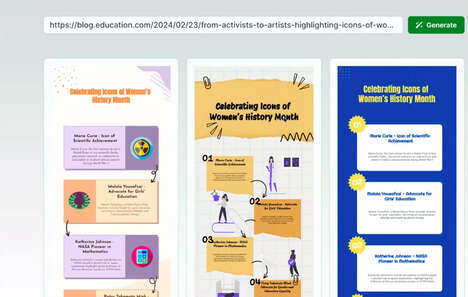
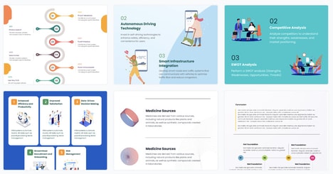
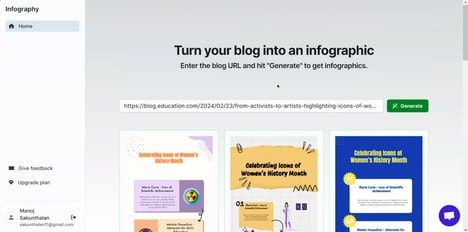
- Visual Infographics
- The use of visually appealing and easy-to-understand infographics to explain complex information.
- Democracy in Action
- The increasing focus on large-scale democratic exercises, such as India's election, as a significant event with global implications.
- Political Transparency
- The demand for clear and concise information about political systems and processes, leading to the creation of infographics to address this need.
Who This Affects Most
- Graphic Design
- The graphic design industry can capitalize on the trend of creating visually appealing infographics for various purposes, including explaining complex information.
- News and Media
- The news and media industry can leverage the trend of using infographics to break down complicated topics and engage their audience.
- Education
- The education industry can adapt the use of infographics to simplify concepts and enhance understanding in subjects like civics and politics.