


Eighthirty Coffee Packaging Was Cured of a Comparatively Bland Image
Amelia Roblin — February 11, 2013 — Marketing
References: butcherandbutcher.co.nz & lovelypackage
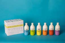
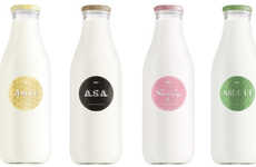
There isn't really a recognizable standard in terms of iced coffee containers, yet it's quite fresh to see Eighthirty Coffee packaging take the form that it does. The stubby tinted bottles have a slightly medicinal look about them, being reminiscent of flasks of syrup that are intended to cure illnesses.
The design by Butcher & Butcher Ltd. certainly makes the ready-made product much more iconic, and with its clean and text-based labeling, consumers are likely to want to reuse the vessels. The sacks of ground coffee beans, the takeout coffee cups and the website branding were also given an overhaul. Eighthirty Coffee packaging exhibits character with its cartoony illustrations on the backs of the plain white pouches for an overall eclectic look with aesthetic flavor.
The design by Butcher & Butcher Ltd. certainly makes the ready-made product much more iconic, and with its clean and text-based labeling, consumers are likely to want to reuse the vessels. The sacks of ground coffee beans, the takeout coffee cups and the website branding were also given an overhaul. Eighthirty Coffee packaging exhibits character with its cartoony illustrations on the backs of the plain white pouches for an overall eclectic look with aesthetic flavor.
Trend Themes
-
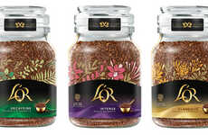
Iconic Packaging Design — There is an opportunity for design firms to create unique packaging designs that make products more iconic and recognizable.
-
Medical Aesthetic Packaging — There is a market for products with packaging that resembles medical supplies or syrups, creating a unique visual identity.
-
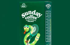
Cartoon Illustrations on Packaging — There is a growing trend of incorporating cartoon illustrations on product packaging, providing a creative and playful design element.
Industry Implications
-
Food and Beverage — Packaging design is becoming increasingly important in the food and beverage industry to differentiate products and increase consumer appeal.
-
Pharmaceuticals — Pharmaceutical companies could incorporate more customer-friendly and visually-appealing packaging that creates a unique and recognizable identity.
-
Graphic Design — Design companies and graphic artists are vital to creating visually-appealing and unique product packaging designs in various industries.
3.8
Score
Popularity
Activity
Freshness