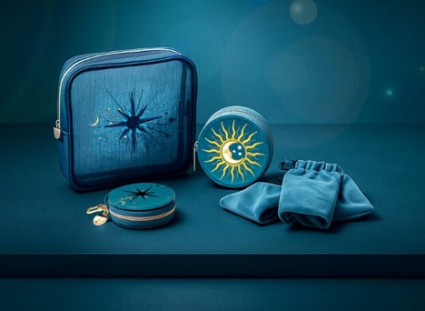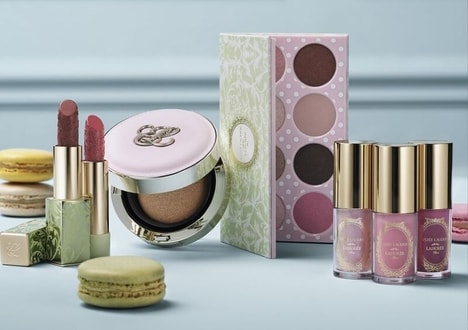

Benefit Cosmetic's Color Collection packaging is a beautiful way to show off the beauty brand's penchant for color as well a bit of the company's history. This comes through in some of subtle shaping on the labels and cosmetic containers that takes inspiration from Art Deco designs, which was prominent in San Francisco where Benefit began.
The designs are playful and optimistic, and in the case of some of the eye shadow containers, traditional makeup packaging is literally flipped on its head. Dotdash was responsible for developing the packaging and branding for Benefit's Color Collection and describes that "We flipped the cream eye shadow upside down, so that the jar is presented on top, showcasing the color and allowing it to refract through the details of the glass."
Why This Trend Is Growing
- Art Deco Design
- This trend presents opportunities for businesses to incorporate Art Deco-inspired elements into their branding and packaging.
- Playful and Optimistic Packaging
- Businesses can explore playful and optimistic packaging designs to create a unique and engaging brand experience.
- Upside Down Packaging
- There is potential for disruptive innovation in the cosmetics industry by experimenting with unconventional packaging designs, such as upside down containers.
Industries Being Reshaped
- Beauty and Cosmetics
- The beauty and cosmetics industry can leverage Art Deco-inspired designs to create visually stunning and nostalgic packaging.
- Graphic Design and Branding
- The graphic design and branding industry can explore the incorporation of playful and optimistic elements in their projects.
- Packaging and Product Design
- The packaging and product design industry can explore unconventional packaging designs, like upside down containers, to stand out in the market.