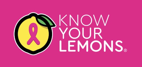

This creative breast cancer ad series for the Breast Cancer Foundation encourage women to spend less time on social media, and instead get themselves checked out by a doctor. The ads were released for Breast Cancer Awareness Month in October and feature witty taglines that read "If only you checked your breasts as often." Each of the app-shaped icons in the ads feature slightly altered versions of the Twitter, Facebook and Instagram logos that are made to look like grabby hands.
All of these are fairly abstract, but the flesh-colored Instagram logo and its circular elements is definitely the most risqué of the bunch. Still, the ads are a clever way to appeal to a generation that values online interaction and good health.
What's Driving This Trend
- Creative Health Ads
- Creative health advertisements that utilize social media logos to grab attention and promote important messages.
- Digital Detox
- The trend of encouraging individuals to reduce their time spent on social media and prioritize their physical health.
- Witty Taglines
- The use of clever and humorous phrases to capture audience attention and convey important health-related messages.
Who This Affects Most
- Healthcare
- Opportunity for healthcare organizations to create innovative advertising campaigns that engage with online-savvy audiences.
- Advertising & Marketing
- Disruptive advertising techniques that use social media logos in a unique way to promote health awareness and encourage behavioral change.
- Social Media
- Potential for social media platforms to collaborate with health organizations to raise awareness and provide resources on important health issues.