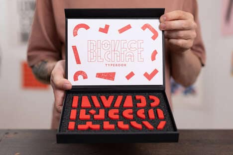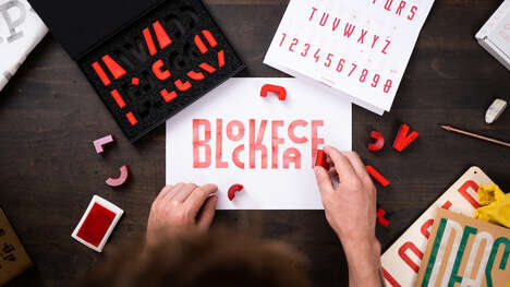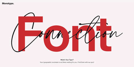
Bold & Noble has jumped on the bandwagon of typographic topography with their font face maps. Typography has been gaining relevance in the realm of art and design at the pace of a forest fire within the passed year. Thus, the Bold & Noble typographic map is right on time.
Though it may not be the first font-infused map created, the Bold & Noble typographic map boasts a sleek, classic look that other variations do not have. With twelve years of experience under its belt, design company Bold & Noble has remained true to their elegant style with this piece.
What's Driving This Trend
- Typographic Topography
- Disruptive innovation opportunity: Explore new ways to incorporate typography into map design, creating unique and visually appealing representations.
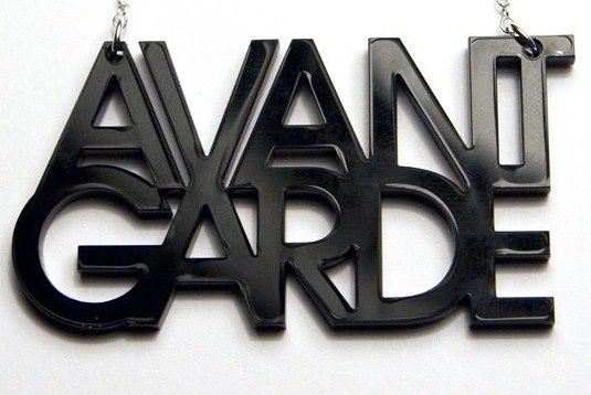
- Font-infused Art
- Disruptive innovation opportunity: Combine typography and art in innovative ways to create visually striking and meaningful pieces.
- Sleek Design Aesthetics
- Disruptive innovation opportunity: Develop sleek and classic design styles that stand out in a saturated market and attract a target audience.
Who This Affects Most
- Art and Design
- Disruptive innovation opportunity: Merge art and design to create unique and captivating pieces that resonate with consumers.
- Mapping and Navigation
- Disruptive innovation opportunity: Integrate typography into mapping and navigation systems to enhance user experience and make information more visually appealing.
- Graphic Design
- Disruptive innovation opportunity: Push the boundaries of graphic design by incorporating typography in new and exciting ways, breaking traditional norms.