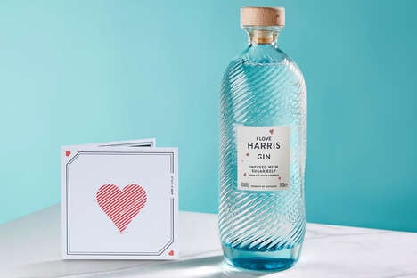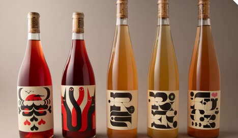
Blue Hugs wine packaging is bound to attract the great group of consumers who shop for alcohol based on the bottle. While connoisseurs are busy buying cabernet sauvignons with delicately etched icons and elegant typefaces, the majority of people might be seduced by the simplicity and the affectionate appearance of this brand.
Designer Timur Salikhov worked to match the name of the vino with the visual identity of the product in a very literal way. The straightforward 'Blue Hugs' label inspired a very simple sticker for the front of the bottle. From the back side of the vessel one can see a pair of hands coming together, having wrapped themselves around the circumference. Blue Hugs wine packaging features a minimal amount of text to identify the beverage, inscribed on the joint arm of the embracing palms.
What's Driving This Trend
- Simplistic Packaging
- Opportunity for brands to attract consumers with minimalistic, visually appealing packaging designs.
- Emotive Branding
- Potential to create emotional connections with consumers through visual representations that reflect the brand's name or identity.
- Iconic Labels
- Opportunity to design labels that utilize simple, recognizable icons to appeal to a broader consumer base.
Who This Affects Most
- Alcoholic Beverages
- Disruptive innovation opportunity for wineries, breweries, and distilleries to differentiate themselves with unique packaging designs.
- Graphic Design
- Opportunity for graphic designers to specialize in creating visually striking labels and packaging for various consumer products.
- Marketing and Advertising
- Potential for marketers and advertisers to explore new strategies in leveraging emotive branding and simplistic packaging to enhance consumer engagement.