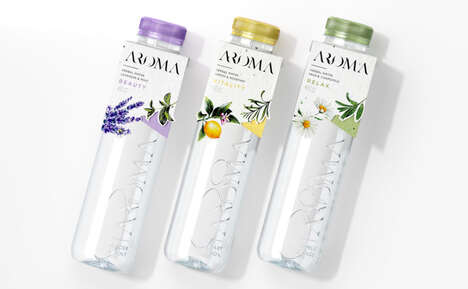
This Ardor branding design by Johnny Haik is inspired by recent floral fashion developments. One of the most significant details about the packaging concept, however, is not necessarily the floral accents, but the fact that this is for a water bottle.
Normally, scenes of rushing water cascading down a glacier or anything nature-related is used to promote the freshness of bottled water. With Ardor, Haik decided to take a completely different route and go with the freshness associated with flowers as well as fashion. Clearly this branding is aimed at more of a female demographic, which is a very large portion of the people that drink bottled water.
While fashion for some designers sticks to the runways, Haik sees an entirely new reason to turn to clothes magazines with this branding for Ardor.
What's Driving This Trend
- Floral Fashion
- Exploring the use of floral fashion patterns and designs in product branding presents disruptive innovation opportunities for various industries.
- Gender-targeted Packaging
- Creating packaging designs that cater to specific demographic segments, such as the female market, opens up potential for disruptive innovation in the packaging industry.
- Fashion-inspired Branding
- Utilizing elements and concepts from the fashion industry in product branding offers opportunities for disruptive innovation across different sectors.
Who This Affects Most
- Beverage Packaging
- Incorporating floral fashion-inspired packaging in the beverage industry can lead to disruptive innovation in the way drinks are marketed and consumed.
- Fashion Publishing
- Collaborating with fashion magazines for product branding can disrupt the publishing industry by expanding its reach beyond traditional fashion accessories.
- Consumer Goods
- Applying fashion-inspired branding strategies to consumer goods can fuel disruptive innovation in how products are perceived and marketed to target customers.