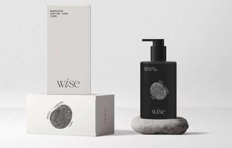
It has been noted by many brand identity designers that consumers are growing to appreciate minimalism more and more in product wrappers; nevertheless, Alishan Tea packaging, with its intricate and ornamental backdrops, avoids the appearance of fussiness.
The success of Victor Design's work has quite a bit to do with the reduced palette. The tea tins have a base of neutral black and the decorative textures applied to them have been printed entirely in gold. The universal familiarity of the tiny repeated motifs also has a less challenging effect on the eyes.
Bright white labels have been positioned on Alishan Tea packaging so that they're off-centered. Between this lighthearted touch and the intricate graphic treatment, the loose leaf contents are afforded the balanced notions of lavishness an clarity of flavor at once.
What's Driving This Trend
- Minimalist Packaging
- Opportunity for brands to disrupt the market by embracing minimalistic packaging designs.
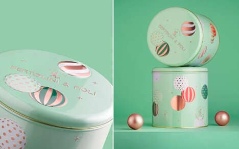
- Intricate Graphic Treatments
- Innovation opportunity for designers to create intricately patterned packaging designs that stand out.
- Off-centered Labels
- Brands can explore the use of off-centered labels to add a playful element to their packaging design.
Who This Affects Most
- Brand Identity Design
- Opportunity for brand identity designers to create unique and visually appealing packaging designs.
- Luxury Tea
- Innovation opportunity for the luxury tea industry to enhance their packaging designs and create a premium experience for consumers.
- Printing Services
- Printing companies can develop specialized techniques for printing intricate textures and patterns on packaging materials.