


Mother's Ruin Gin Boasts Bold and Dark Packaging
Chalaine Mantha — February 5, 2011 — Marketing
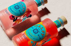
References: danielbrokstad & thedieline
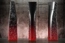
Mother's Ruin Gin boasts a sleek, black design highlighted with bright yellow and white typography and images. This was a self-initiated project by Daniel Brokstad, who explains that Mother’s Ruin is a premium London Dry gin with a focus on "delivering a pleasing high end experience for any gin lover."
The name “Mother’s Ruin” was a slang term for gin in England at one point. If you happen to collect alcohol bottles, this would definitely make a great one for the collection.
The name “Mother’s Ruin” was a slang term for gin in England at one point. If you happen to collect alcohol bottles, this would definitely make a great one for the collection.
Trend Themes
-
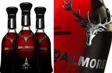
Dark Packaging Trend — Exploiting the trend of sleek and black packaging design with bold typography and contrasting colors.
-
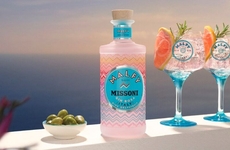
Premium Gin Trend — Catering to the increasing demand for high-end gin experiences with a focus on delivering a pleasing experience.
-
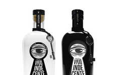
Alcohol Collectibles Trend — Capitalizing on the popularity of collecting alcohol bottles by offering unique designs and branding.
Industry Implications
-
Alcoholic Beverages Industry — Innovating packaging and branding strategies to stand out in the competitive alcoholic beverages market.
-
Design and Packaging Industry — Developing cutting-edge packaging designs and brand identities to meet the demand for sleek and visually appealing products.
-
Collectibles Industry — Creating limited edition and unique alcohol bottle designs to cater to the growing market for collectible items.
1.8
Score
Popularity
Activity
Freshness