


The Dirty Water Infographic Shows the Disparities and Problems
Christopher DeLuca — June 12, 2011 — Social Good
References: awesome.good.is.s3.amazonaws & good.is
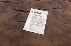
The Dirty Water infographic illustrates the disparity in which we access clean drinking water. Sub-Saharan Africa ranks as the worst region in terms of access to clean drinking water, with just over half the population having access; at the other end of the spectrum are the Industrialized countries with a 100 percent access rate.
Another interesting fact about the global water supply that the Dirty Water infographic drew my attention to was that 70 percent of fresh water is unattainable -- that is a staggering amount of water. The Dirty Water infographic itself is clear and well laid out.
The UN claims that a lack of sanitary water supply kills more people annually than war. That claim alone should push the issue of sanitary water access into the public discourse.
Trend Themes
1. Disparity in Water Access - Identifying and addressing the disparities in access to clean drinking water worldwide.
2. Water Scarcity - Exploring innovative solutions to combat the scarcity of fresh water resources.
3. Sanitary Water Supply - Developing technologies and systems to ensure access to clean and safe drinking water for all.
Industry Implications
1. Water Filtration and Purification - Opportunity for companies to create affordable and efficient water filtration and purification systems.
2. Sustainable Agriculture - Opportunity to develop water-efficient irrigation techniques and practices in the agriculture industry.
3. Water Technology - Potential for innovative water technologies that can improve access to clean drinking water in remote areas and regions with limited resources.
1.9
Score
Popularity
Activity
Freshness