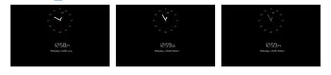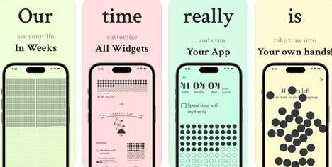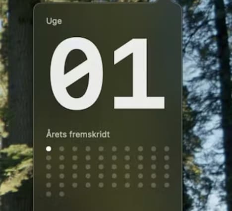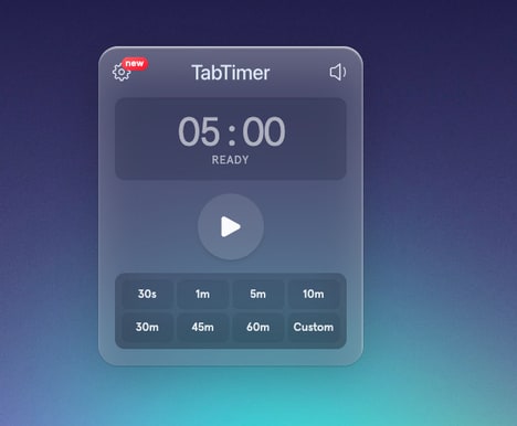
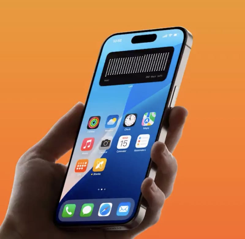
Left offers a visual time awareness, conceptually rethinking of how individuals engage with time. Using a minimalist interface built around dot-based visualizations, it translates abstract timelines into tangible, interpretable patterns. Each dot signifies a defined unit — such as a day, week, or month — allowing users to visualize their progression through personal, professional, or life milestones.
This unique approach encourages reflection, helping individuals contextualize time not as a series of deadlines but as a measurable journey. From a design and business perspective, Left highlights how data visualization can influence perception and behavior. By turning an intangible concept into a visual experience, it aligns with the growing interest in digital wellness and mindful productivity—offering a subtle yet powerful tool for fostering intentional living and long-term perspective.
Image Credit: Left
Key Themes Behind This Trend
- Mindful Productivity
- The rise of tools that promote intentional living through visual feedback echoes a broader shift towards achieving balance in digital work environments.
- Dot-based Visualizations
- Utilizing minimalist dot-based graphics transforms complex data into easily digestible formats, enhancing user engagement and accessibility.
- Digital Wellness Tools
- There is a growing demand for applications that integrate wellness into the digital experience, encouraging healthier interactions with technology.
Where This Applies
- Data Visualization
- With the innovative use of visual tools to reshape abstract concepts, companies have new opportunities to develop engaging communication platforms.
- Personal Development
- As digital interfaces support personal growth by visualizing time as a journey, the sector is primed for solutions that enhance life planning and milestone tracking.
- Productivity Software
- Emerging applications that provide clarity on time management through visual aids could redefine traditional productivity tools in professional environments.