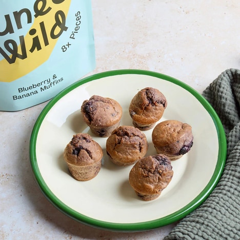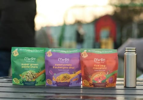

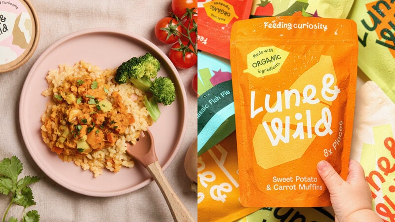
Lune & Wild is rebranding from Wild People, recasting its organic snacks and meals for little ones in baby-food pouches colored yellow, orange and green. The U.K. redesign puts the featured food up front for parents and trades the aisle’s usual plain or cartoon-led look for cut-paper artwork.
Each pack pairs a hand-cut illustration of a main ingredient, such as carrot or sweet potato, with wobbly lettering that reads clearly at a glance. In the U.K., the shift lands as baby food makers work through the 18-month window set in August 2025 to reduce sugar and salt and avoid misleading health claims.
Ingredient-led graphics turn the pouch into a quick cue for what is inside, helping parents scan faster without dense front-of-pack messaging. The handmade treatment also moves the category closer to authenticity and simplicity, a useful position as regulation narrows what brands can promise in words.
Image Credit: DIELINE
What Makes This Trend Stand Out
- Ingredient-first Packaging
- Visual emphasis on primary ingredients creates differentiation as stricter labeling rules limit the health claims brands can make in words.
- Handcrafted Visual Branding
- Cut-paper artwork and imperfect lettering signal authenticity in categories where parents are seeking simpler, more trustworthy product cues.
- Regulation-responsive Design
- Packaging systems that communicate clearly through imagery offer new value as food brands adapt to evolving restrictions on sugar, salt and wellness messaging.
Sectors Adopting This
- Baby Food
- Organic pouches with transparent ingredient cues reflect a shift toward faster parental decision-making in a highly scrutinized nutrition category.
- Packaging Design
- Illustration-led formats provide fresh territory for agencies helping consumer brands stand out without relying on dense claims or cartoon conventions.
- Organic Snacks
- Clean-label snack makers can benefit from visual storytelling that reinforces simplicity and quality while aligning with rising regulatory and consumer expectations.