
Studio Epitah is a creative agency based in the United Kingdom that conceptualized the packaging and branding for The Great British Porridge Company’s products.
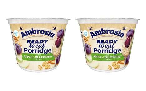
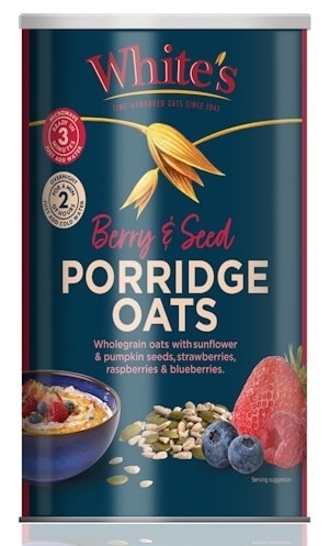
The most interesting aspect of the brand’s packaging is that it features dozens of images of fruits, each of which were formed with cut out photography rather than being grouped together. The resulting effect is an image that is simultaneously playful and elegant, and that is able to perfectly convey the brand’s focus on foods that are both highly nutritious, and flavorful. The images themselves feature blueberries, dried oats, dried cranberries, banana slices, and more.
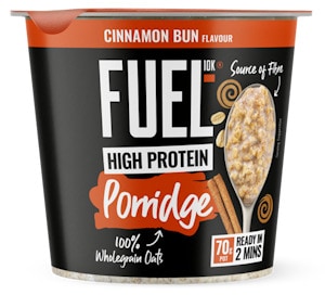
The Great British Porridge Company’s designs perfectly merge contemporary photographs with the more classic imagery oatmeal brands tend to be associated with.
What's Driving This Trend
- Cut-out Photography Packaging
- Using cut-out photography in packaging design creates a playful and elegant visual effect.
- Nutritious and Flavorful Foods
- Brands focusing on highly nutritious and flavorful foods are gaining popularity.
- Modernizing Classic Imagery
- Brands that merge contemporary and classic imagery are reinventing traditional products.
Who This Affects Most
- Creative Agencies
- Creative agencies have the opportunity to incorporate cut-out photography in their packaging designs.
- Food and Beverage
- The trend of focusing on highly nutritious and flavorful foods presents opportunities for innovation in the food and beverage industry.
- Packaging and Branding
- The integration of contemporary and classic imagery in packaging design is a disruptive innovation opportunity for the packaging and branding industry.