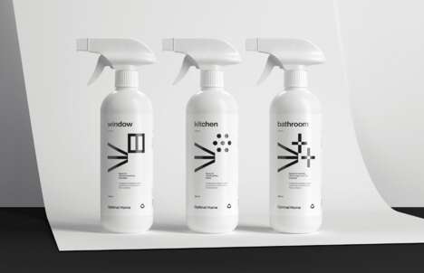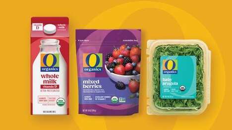
Shelf presence was taken quite seriously in the conception of the new Earthwise packaging, because even if a product's image looks appealing on its own, it must still be picked out of a lengthy lineup of competing brands.
Without making use of vivid visuals and flashy colors, the Brian R. Richards Limited studio explored the technique of repeated motifs to attract attention. Doubling as a raindrop, the small symbol of a leaf is copied over and over again into a pattern on the bottom half of the boxes and bottles. When the range of different laundry detergents and dishwasher soaps are displayed in a row, the organic ornamentation expands and becomes noticeable, despite the soft eco aesthetic of Earthwise packaging.
Why This Trend Is Growing
- Repeated Motifs
- Exploring the use of repeated motifs in packaging design to attract attention on the shop shelf.
- Organic Ornamentation
- Incorporating organic ornamentation into packaging design to create a noticeable and eco-friendly aesthetic.
- Shelf Presence
- Considering the importance of shelf presence in packaging design to stand out among competing brands.
Industries Being Reshaped
- Packaging Design
- Opportunities for incorporating repeated motifs and organic ornamentation into packaging design to enhance shelf presence.
- Consumer Goods
- Innovations in packaging design for laundry detergents and dishwasher soaps to create a distinctive and eco-friendly visual identity.
- Retail
- Utilizing visually appealing packaging designs to attract consumer attention and drive sales in a competitive retail environment.