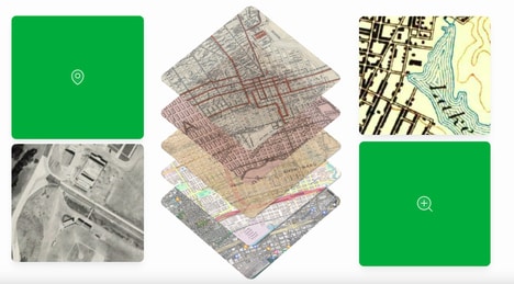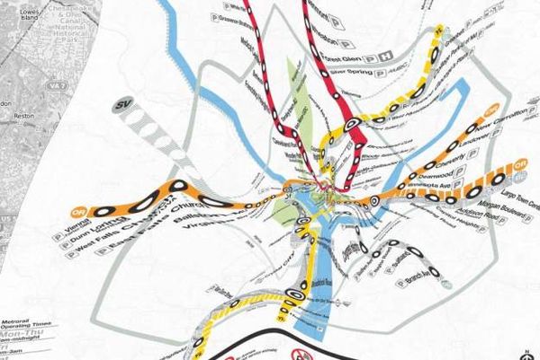
The Corrected Subway Maps series shows what such common diagrams would look like when depicted accurately in terms of scale and dimension. This was achieved by overlaying the existing subway maps on top of Internet map-tile view of the cities New York, Boston and Washington. By doing so, they give a people information not only of train stop and routes, but also of distance and topography.
Created by Benjamin M. Schmidt, an assistant professor of history at Northeastern University in Boston and a core faculty member at the NuLab for Texts, Maps, and Networks, the Corrected Subway Maps series essentially represent the “tension between two different ways of representing the same urban spaces," as stated by the creator. He used QGIS, Leaflet, and some command-line GDAL tools.
What Makes This Trend Stand Out
- Accurate Transit Maps
- Opportunity to develop more accurate transit maps that provide not only train stop and routes, but also distance and topography information.
- Internet Map-tile View
- Opportunity to overlay existing subway maps on top of internet map-tile view to create more informative and visually appealing transit maps.
- Integration of Technology
- Opportunity to use tools like QGIS, Leaflet, and command-line GDAL tools to create transit maps that integrate technology and provide enhanced user experience.
Sectors Adopting This
- Transportation
- Disruptive innovation opportunity to develop more accurate and visually appealing transit maps for public transportation systems.
- Technology
- Disruptive innovation opportunity to develop and use advanced mapping tools and integration of technology for creating innovative transit maps.
- Design
- Disruptive innovation opportunity to revolutionize the design of transit maps by incorporating accurate topography and distance information.