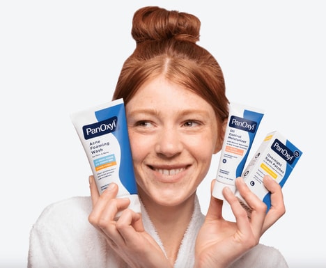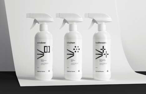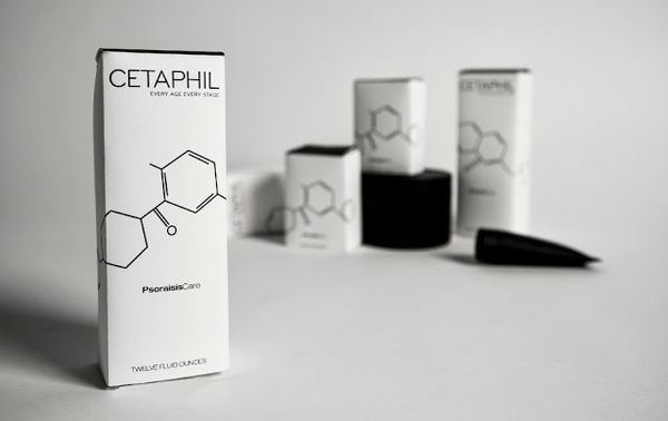
Skincare products of the scientifically based variety often struggle to brand themselves. This example of conceptual Cetaphil packaging strives to communicate a precise clinical component, all the while assuming an aesthetically pleasant appearance to compete with the mainstream brands.
Quite cleverly, Gabriela Farina highlighted the soft medicinal quality of the cleansers and lotions by devising graphics that illustrate chemical bonds. These, however, were drawn up with fine lines for a sharp and minimalist image. Printed in black on white boxes, these diagrams are accompanied by a bit of black text. The overall visual impression of this conceptual Cetaphil packaging scheme is clean and pure and certainly represents the products inside in a balanced manner.
What's Driving This Trend
- Scientific Branding
- Opportunity for skincare companies to communicate their scientific approach through unique packaging designs.
- Minimalist Packaging
- Potential for brands to stand out in the skincare market by adopting clean and minimalist packaging designs.
- Aesthetic Competition
- Increasing need for scientifically based skincare products to create visually appealing packaging to compete with mainstream brands.
Who This Affects Most
- Skincare
- Skincare industry can explore innovative packaging techniques to communicate the scientific nature of their products.
- Design
- Design firms have an opportunity to assist skincare companies in creating minimalistic and aesthetically pleasing packaging designs.
- Printing
- Printing companies can benefit by offering specialized printing services to produce clean and precise packaging designs for skincare products.