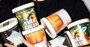

This impressive coffee and ice cream shop packaging was actually developed for the fictional Demitasse Creamery as part of a student project by Brianne Boland. The bold contrast in product offerings is represented in the vibrant black, white and yellow coloring of the cups and containers, which shows off more of its fun personality with witty quips like: "Depresso: the feeling you get when this cup is empty" printed on them.
Boland describes the choice of yellow as a "HI-HOW-ARE-YA hue," and a perfect blend of everything the Demitasse Creamery is about—modernity, youthfulness, excitement and mischief. Graphics for the Demitasse Creamery brand are basic, featuring simple shapes, patterns and icons that are playful and smile-inducing.
Why This Trend Is Growing
- Colorful Packaging
- Opportunity for brands to create vibrant and eye-catching packaging that reflects their personality and engages customers.
- Witty Quips
- Opportunity to incorporate clever and humorous statements on packaging to create a memorable and entertaining experience for customers.
- Playful Graphics
- Opportunity to use simple shapes, patterns, and icons in branding to evoke a sense of fun and joy.
Industries Being Reshaped
- Food and Beverage Packaging
- Innovative packaging designs can disrupt the food and beverage industry by capturing consumer attention and conveying brand personality.
- Coffee and Ice Cream Shops
- Coffee and ice cream shops can differentiate themselves by adopting exciting and engaging packaging strategies like those showcased in the article.
- Graphic Design
- There is a growing demand for creative graphic designers who can create visually appealing and playful brand identities.