For anyone who might be suspicious about the quality and authenticity of the products that they buy at the supermarket, Bio Organic Milk packaging serves up some peace of mind. Designed by spoondesign of Greece, the brand identity references the origin of the calcium-rich beverage and communicates an overall earthy image that's wonderfully appealing.
The textured brown paper material that makes up the rectangular milk cartons has a crisp and raw look that's quite natural. You can see exactly where ink was printed minimally, creating a cute illustration of a white cow that's contently chewing away on a mouthful of fresh green grass. An extra large nose enhances the endearing factor of Bio Organic Milk packaging's mascot. The beverage's information is then playfully applied to the body of the cow with a casual handwritten typeface.
Key Themes Behind This Trend
- Bio Organic Packaging
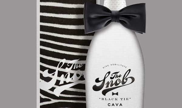
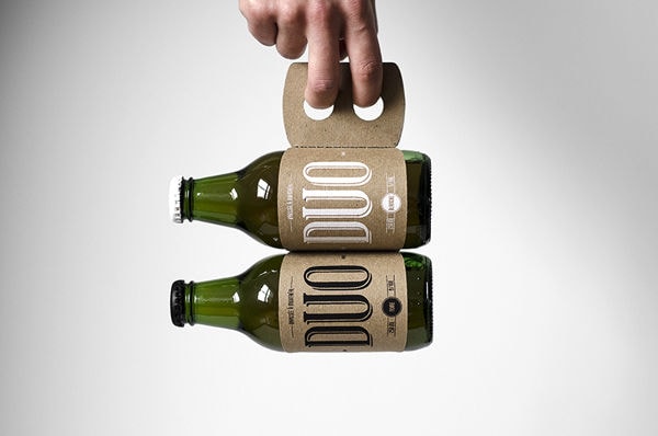
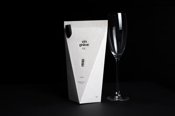
- Disruptive innovation opportunities lie in the development of eco-friendly and sustainable packaging solutions for food and beverage products.
- Authenticity Assurance
- There is a growing trend towards transparent and trustworthy branding that assures consumers of the quality and origin of the products they purchase.
- Minimalistic Design
- Simplicity and minimalism in packaging design can create a strong visual impact and appeal to consumers looking for a clean and natural aesthetic.
Where This Applies
- Food Packaging
- The food packaging industry has an opportunity to adopt eco-friendly materials and designs that enhance the freshness and authenticity of products.
- Organic Food
- Organic food industry can leverage transparent and appealing packaging to communicate the quality and organic nature of their products.
- Graphic Design
- There is a need for creative graphic designers who can develop minimalistic and visually appealing packaging designs that resonate with eco-conscious consumers.