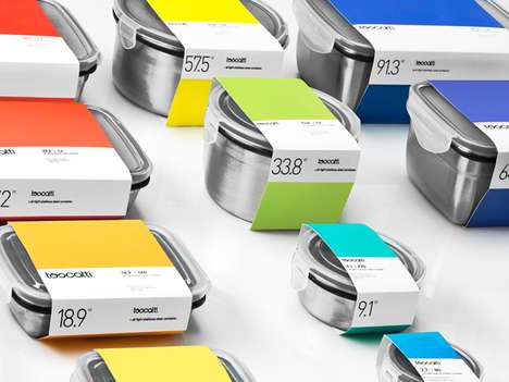
Premium kitchenware company Toscatti teamed up with the Anagrama design firm to create a fresh, approachable look for the debuting brand. Focusing on Toscatti's large line of durable kitchen containers, Anagrama thought it was best to categorize the different size and capacity characteristics of the culinary cases in an intuitive way. It was determined that color coding was the most logical form of categorization that could be easily identified on store shelves.
Rather than add unnecessary flourish to something that was already incredibly vibrant, Anagrama took a minimalist route and made the Toscatti labels appear as simple pantone chips. Creating a strong visual impact, the Toscatti labels are memorable in their minimalism and brilliant color. The logo was created using geometric shapes, but the typography is devoid of sharp edges in order to make the brand appear friendly and approachable.
Simple, straightforward and eye-poppingly vibrant, the Toscatti packaging is as beautiful as it is intuitive.
What Makes This Trend Stand Out
- Color Categorization
- Using color coding to categorize products for customer convenience.
- Minimalist Design
- Opting for simple and clean designs to create a strong visual impact.
- Friendly Branding
- Creating approachable and friendly branding through typography and design choices.
Sectors Adopting This
- Kitchenware
- Applying color coding and minimalist design to kitchenware products.
- Packaging
- Utilizing color categorization and minimalist designs for packaging.
- Branding
- Exploring friendly and approachable branding through design and typographic choices.