


The NYC Energy Consumption Map Shows Amounts of Electricity Usage
Leslie Chen — February 6, 2012 — Art & Design
References: modi.mech.columbia.edu & notcot.org
It's not surprising that a big city like New York would use a lot of energy each year, but the NYC Energy Consumption Map makes the statistics of just how much look absolutely stunning.
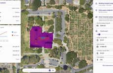
The map illustrates the amount of energy consumption, with red meaning the highest, yellow meaning lesser so and green representing open spaces like parks. A quick look at the map will reveal that Manhattan uses the most energy while the other boroughs like Queens and Brooklyn use a significantly lower amount. The website's About page reveals that buildings used for health and education purposes take up the majority of energy usage.
Even if you're not interested in the numbers and figures, the NYC Energy Consumption Map is amazing just to look at.
Trend Themes
1. Energy Consumption Mapping - Opportunity to develop advanced mapping technologies to visualize energy consumption patterns in cities.
2. Urban Energy Efficiency - Potential for businesses that offer energy-efficient solutions for urban buildings to reduce consumption and costs.
3. Data-driven Energy Management - Disruptive innovation opportunity in using real-time data to optimize energy usage in urban areas, leading to significant savings.
Industry Implications
1. Building Management Systems - Opportunity for companies in the building management industry to integrate energy consumption analysis into their systems and offer insights for improved efficiency.
2. Smart City Solutions - Potential for smart city technology providers to leverage energy consumption data to create holistic city management solutions.
3. Renewable Energy Providers - Opportunity to collaborate with cities in developing renewable energy infrastructure based on energy consumption patterns.
2
Score
Popularity
Activity
Freshness