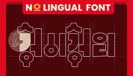
Peter Kay's creative dual-meaning typography comprises colorful alterations to old adages and new sayings. Kay's creations are often sold via t-shirts but I actually prefer them on the computer--you'll have a new and fresh desktop background for every day!
The dual-meaning typography by Kay features sayings like "Our Love Doesn't Change/Age" and "S/Aint." I really like his use of color as well, and the way he has mixed words to create different meanings. The results are pretty awesome.
Key Themes Behind This Trend
- Dual-meaning Typography
- Exploring the use of typography to create double meanings, allowing for creative expression and thought-provoking designs.
- Colorful Alterations
- Utilizing vibrant colors to enhance the impact of typography, creating visually appealing and engaging designs.
- Creative Desktop Backgrounds
- Creating unique and fresh desktop backgrounds by incorporating dual-meaning typography, adding a touch of creativity to computer screens.
Where This Applies
- Graphic Design
- Exploring how dual-meaning typography can be utilized in graphic design to create visually captivating and innovative designs.
- Apparel and Fashion
- Incorporating dual-meaning typography into t-shirt designs, offering customers unique and engaging fashion choices.
- Digital Product Design
- Integrating dual-meaning typography into digital interfaces, providing users with visually interesting and thought-provoking experiences.