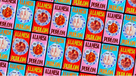
It isn't unusual to see closeup photographs of vegetables on soup cans, but the graphic technique employed in Delhaize Soup packaging does this differently. This notion of a "close-up" is exercised in a playful way through the suggestion that these foods are actually gigantic in scale.
The motif that ties each of these containers together is the image of a waiter's hand balancing a plate and soup bowl. This has been rendered in black and white. Lavierna & Cienfuego Design introduced a splash of color into the backgrounds to correspond to the particular principal ingredient within each plastic tub; however, the most eye-catching feature of Delhaize Soup packaging is the inclusion of magnified tomatoes, onions and mushrooms that emerge whole and too large for their dishes.
What Makes This Trend Stand Out
- Gigantic Food Branding
- Incorporate playful designs that exaggerate the size of ingredients to create a unique and eye-catching product packaging.
- Color-coded Packaging
- Use color to code the packaging according to the specific principal ingredient to make it easier for customers to distinguish different soup flavors.
- Close-up Food Imagery
- Experiment with graphic design techniques that utilize close-up images of vegetables to make the product packaging more visually appealing.
Sectors Adopting This
- Consumer Packaged Goods
- CPG companies can incorporate playful designs that alter the size perception of ingredients in their packaging to make their products stand out on the shelves.
- Food and Beverage
- The food and beverage industry can use color-coded packaging to differentiate between product flavors and increase brand recognition.
- Graphic Design
- Graphic design companies can experiment with incorporating close-up food imagery in their designs to create visually appealing product packaging for their clients.