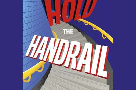
Graphic designer and illustrator Josip Kelava has released a beautiful, dreamy 2012 ad campaign for Australia's Melbourne Dance Company. The poster features a very interesting typeface and charming pastel colours with a sole ballerina pictured. The combination of the font and colors do a good job at catching the eye, truly illustrating the moving art that is dance.
Kelava's vision of the Dance Company's brand identity includes the tagline "where motion is poetry." While imagery of ballet is not often unpleasant, this design does a good job at capturing the dance form's pristine and prim connotations. The barely-legible font face used is true to the tagline, showing that dance is something that can be abstract, but is always elegant.
What's Driving This Trend
- Dreamy Dance Ads
- Opportunity for graphic designers to create visually stunning ads for dance companies
- Abstract Branding
- An opportunity to create brand identities that capture the elegance and abstract nature of dance
- Pristine Font Use
- An opportunity for exploration of innovative font use in advertising and branding
Who This Affects Most
- Advertising
- An opportunity for advertising agencies to create more effective campaigns for dance companies
- Graphic Design
- An opportunity for graphic designers to showcase their creativity and innovation in designing for dance companies
- Performing Arts
- Opportunity for dance companies to rebrand and redesign their marketing materials to appeal to a wider audience