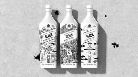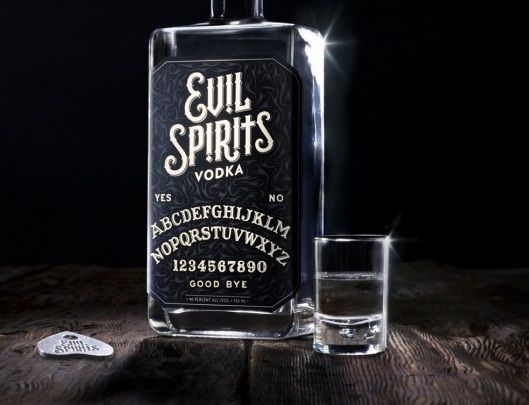
Ignore the text on White Pike Whiskey packaging and what would you assume is inside of it? Mother Design chose this wine bottle type of container to make the spirit appear more like a vodka product than a malted grain recipe. The reason for this was to communicate the surprising strength of the alcoholic beverage as a mixer with other sorts of drinks.
The designers strove to cut the crap with a no-BS approach to the product's brand identity, beginning with a transparent glass vessel that then seems to have been dipped in a can of black paint. The visual impact packs a punch and makes the written label of White Pike Whiskey packaging stand out even more.
Key Themes Behind This Trend
- Monochromatic Packaging
- The trend of using monochromatic packaging can create a sleek and modern look for products, capturing consumers' attention.
- No-bs Brand Identity
- Embracing a no-BS approach to brand identity can help businesses communicate authenticity and cut through the clutter in the market.
- Transparent Glass Packaging
- Using transparent glass packaging can provide a sense of transparency and trust to consumers, showcasing the product's quality.
Where This Applies
- Alcoholic Beverage
- The alcoholic beverage industry can explore monochromatic packaging to create a strong and eye-catching presence on store shelves.
- Graphic Design
- The graphic design industry can embrace the trend of no-BS branding to help businesses create impactful and distinctive visual identities.
- Food and Beverage
- The food and beverage industry can utilize transparent glass packaging to highlight the quality and freshness of their products to consumers.