None.ru Updates the Visuals for the Moscow Tram System
Jamie Danielle Munro — May 9, 2014 — Art & Design
References: none.ru & designboom
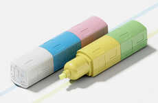
The Moscow Tram System maps were in dire need of an upgrade, as many people were having difficulties reading the directions. Each section was found on a different sheet, making it hard to visualize exactly where the trams corresponded with the actual landscape. The branding agency None.ru consolidated everything into one easy-to-read sheet and color-coded the system too.
Each line has its own color for representation, and not only does the map look good, but it's also extremely functional too. When traveling in Moscow, people were complaining that it was near impossible to read the original tram map, but None.ru has changed this for both tourists, as well as the people living in the city.
Photo Credits: designboom, none.ru
Trend Themes
1. Consolidated Transportation Maps - Creating simplified, consolidated transportation maps that are easy to read and navigate.
2. Color-coded Systems - Implementing color-coded systems to enhance the visual representation and functionality of transportation maps.
3. User-friendly Mapping Solutions - Developing user-friendly mapping solutions that address the needs and challenges of travelers and residents alike.
Industry Implications
1. Public Transportation - Improving the mapping and navigation experience for public transportation systems.
2. Marketing and Branding - Applying branding strategies to enhance the design and functionality of transportation maps.
3. Information Technology - Leveraging technology to create innovative and user-friendly mapping solutions.
0.5
Score
Popularity
Activity
Freshness


