


Julian Burford Renders Food Favorites to Denote New Cuisine-Related Program
References: behance.net & daily.designcollector.net
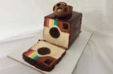
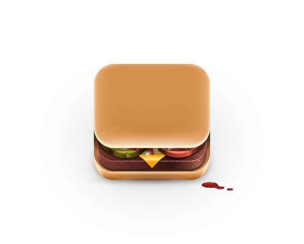
Steve Job’s ideology on making icon graphics was that they should look good enough to eat, and it seems graphic designer Julian Burford took that advice literally. He’s taken hamburgers, Oreo cookies, Campbell’s Soup cans, Domino’s Pizza boxes and other food products and made them into glossy square graphics to be used in an upcoming food app for the iPhone. Burford’s creations are so saliva-inducing that users may not be able to handle being teased with such delicious-looking food every time they open up their phones.
Though Julian Burford had to make his icons more angular to satisfy Apple apps icon guidelines, he still managed to convey prominent attributes associated with each product. He also toys with perspective to give his creations an ingenious three-dimensional look.
Though Julian Burford had to make his icons more angular to satisfy Apple apps icon guidelines, he still managed to convey prominent attributes associated with each product. He also toys with perspective to give his creations an ingenious three-dimensional look.
Trend Themes
-
Food-related App Icons — Opportunity to create visually appealing and appetizing app icons that enhance the user experience.
-
3D Graphics for App Design — Opportunity to use 3D perspective to make app icons more engaging and interactive.
-
Creative Use of Iconography — Opportunity to think outside the box and use unconventional objects like food items as app icons.
Industry Implications
-
Graphic Design — Opportunity for graphic designers to explore new ways of creating visually stunning app icons.
-
Mobile App Development — Opportunity for mobile app developers to innovate in app design by using enticing and appetizing icons.
-
Food and Beverage — Opportunity for food and beverage companies to collaborate with app developers and incorporate their products in app icons.
6.5
Score
Popularity
Activity
Freshness