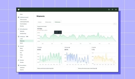
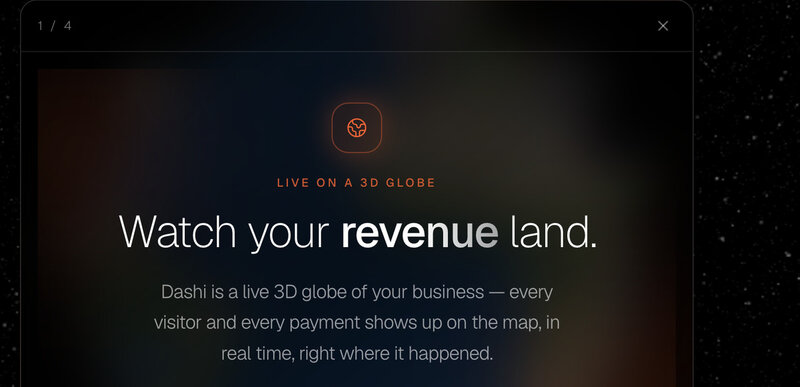
Traditional business dashboards can make global customer activity difficult to visualise, particularly when data is spread across multiple charts and tables. Dashi Metrics takes a geographic approach by mapping visitors and payments onto an interactive 3D globe in real time. Users can spin and zoom around the globe to explore where activity is coming from as it happens.
The visual format is designed to make global trends and customer behaviour easier to understand at a glance, while giving SaaS teams and founders a more engaging alternative to static dashboards. By connecting geographic data with live business activity, Dashi Metrics can help users identify patterns in where their customers are located and how activity changes over time.
Image Credit: Dashi Metrics
Key Themes Behind This Trend
- Spatial Revenue Intelligence
- Interactive geographic analytics reveal new potential for turning global customer activity into intuitive visual systems that make revenue patterns easier to interpret.
- Real-time Business Visualization
- Live data environments create openings for dashboard alternatives that translate fast-changing customer and payment behavior into more immersive decision tools.
- Founder-friendly Analytics
- Simplified visual interfaces suggest demand for analytics products that help lean SaaS teams understand performance without relying on complex reporting workflows.
Where This Applies
- Business Intelligence
- Geospatial dashboards point to opportunities for BI platforms to differentiate through more engaging, exploratory formats beyond charts and tables.
- Saas Analytics
- Revenue and visitor mapping expands the role of SaaS analytics by connecting customer location data with real-time product and payment activity.
- Data Visualization
- 3D globe-based interfaces demonstrate how visualization tools can make distributed business data more accessible, memorable, and context-rich for professional users.