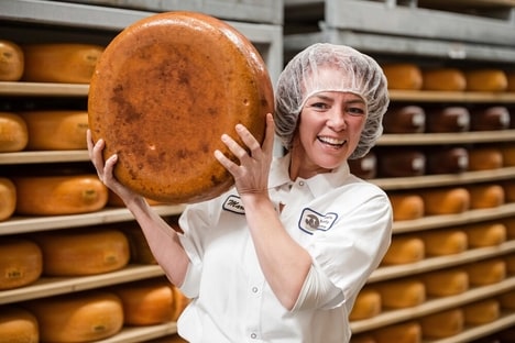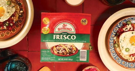
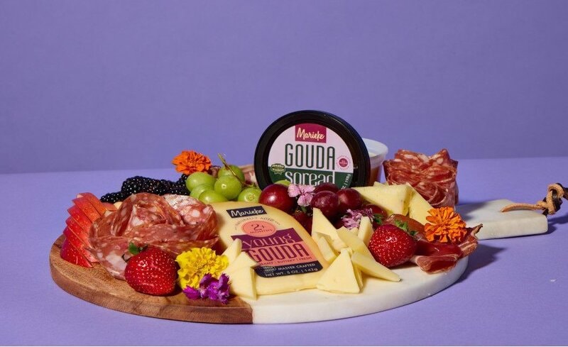
Marieke Gouda is giving its cheeses a clearer shelf presence with a new logo and redesigned packaging that make flavors easier to spot. The Wisconsin cheesemaker, known for Dutch-style Gouda, refreshed packaging across its cheese range with brighter colors, bolder lettering, and a more contemporary feel.
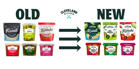
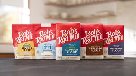
The revised packs give the word Gouda and each flavor more space, reducing visual clutter that can slow a purchase. Richer hues and plant-inspired accents make the cheeses feel livelier and easier to distinguish from one another. That styling also nudges Gouda toward a more giftable, specialty-shelf look.
For shoppers, this means a faster, more confident pick in the artisan case when several wedges compete for attention. A clearer, more expressive pack makes flavor the deciding cue, rather than requiring buyers to recognize the brand first.
Image Credit: Marieke Gouda
Why This Trend Is Growing
- Flavor-first Packaging
- Clear flavor hierarchy on packaging creates shelf differentiation for specialty foods where shoppers make quick comparisons among visually similar products.
- Color-coded Artisan Branding
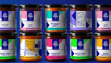
- Vivid color systems and expressive accents can turn small-batch products into more navigable, collectible, and giftable retail experiences.
- Decluttered Shelf Design
- Minimal visual layouts support faster purchase confidence by reducing cognitive friction in crowded premium grocery displays.
Industries Being Reshaped
- Specialty Cheese
- Artisan dairy brands can use packaging refreshes to make nuanced flavor portfolios easier to understand without relying solely on brand familiarity.
- Premium Grocery
- Retailers benefit from clearer product communication in curated cases where packaging design influences browsing speed and perceived quality.
- Food Packaging
- Design firms and packaging suppliers have room to develop adaptive visual systems that balance craft cues with modern retail readability.