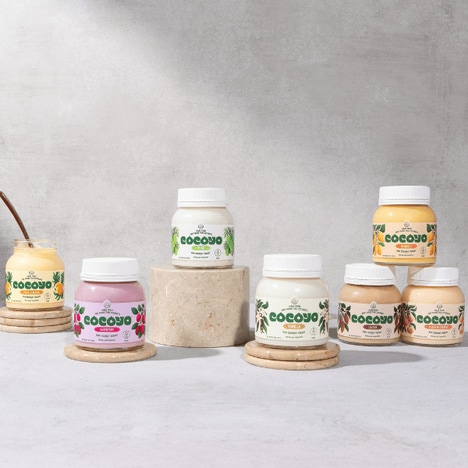
From the look of Be O' Juice packaging, it appears distinctively as the face of a brand with a priority for quality and nutrition. The pristine white bottles display little other than mouthwatering closeups of fresh juicy fruits.
Such is the popular technique for merchandizing organic goods; sticking as close as one can to a very clean-looking design. Creators Gloria Kelly, Yesika Aguin and Monica Lopez began with an elegant shapely container with natural contours, chalk-colored and opaque to protect the delicate drink inside.
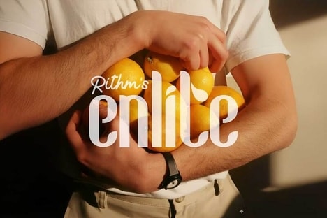
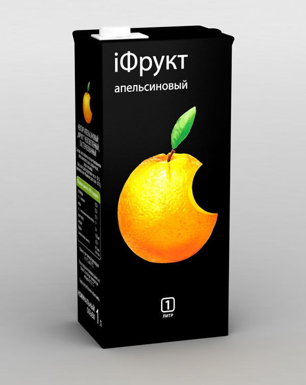
To allude to its vibrant contents, Be O' Juice packaging has been accented with a single image of a slice of the beverage ingredients. Pairs of fruits are spliced together to serve up delicious looking symbols of the products' integrity and taste.
Key Themes Behind This Trend
- Clean Minimalist Packaging
- Opportunities for disruptive innovation in packaging design by emphasizing a clean and minimalist aesthetic.
- Emphasis on Ingredient Transparency
- Opportunities for disruptive innovation in the food and beverage industry by highlighting the organic ingredients and promoting transparency.
- Visual Appeal Through Close-up Imagery
- Opportunities for disruptive innovation in visual branding by utilizing close-up imagery of fresh fruits to create a visually appealing product.
Where This Applies
- Packaging Design
- Opportunities for disruptive innovation in packaging design by exploring new materials, shapes, and minimalist aesthetics.
- Food and Beverage
- Opportunities for disruptive innovation in the food and beverage industry by focusing on organic and transparent ingredients, appealing to health-conscious consumers.
- Visual Branding
- Opportunities for disruptive innovation in visual branding by creating eye-catching product imagery and utilizing close-up shots of fresh ingredients.