


Xefer Analyzes Usage & Habits
References: xefer & notcot.org
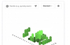
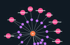
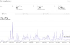
With so many people addicted to Twitter, it would be neat to view a chart of a person's tweets statistics, giving an insight into their habits and usage patterns.
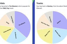
Powered by Yahoo Pipes & Google Charts, xefer allows you to create scatter plots and charts of a Twitter user's tweets. You can choose to view the data by hour, day of the week, month or a combination of those.
I am not sure what practical use such a tool will serve, but I think it is cool nonetheless.
Trend Themes
-
Social Media Analytics — Developing new tools for analyzing social media usage patterns can give insight into consumer behavior and social trends.
-
Data Visualization — Creating more visually appealing ways to display data can make it easier to understand and interpret, and can lead to new insights and discoveries.
-
Artificial Intelligence and Machine Learning — AI and machine learning algorithms can be applied to social media data to uncover hidden patterns and insights that would otherwise be difficult or impossible to find.
Industry Implications
-
Marketing and Advertising — Developing social media analytics tools can help businesses better understand their customers and target their advertising to be more effective.
-
Social Media Platforms — Integrating data visualization tools into social media platforms can enhance the user experience and provide more valuable insights to users.
-
Data Science and Analytics — Applying AI and machine learning techniques to social media data can lead to new discoveries and insights in the field of data science and analytics.
1.6
Score
Popularity
Activity
Freshness