


This Duffy’s Drinking Infographic Will Make You Re-Think Your Next
Courtney Scharf — July 29, 2012 — Lifestyle
References: duffysrehab & visual.ly
This Duffy’s drinking infographic is a walkthrough of misunderstood health tips.
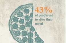
Discussing the recommendations pertaining to how much one should drink, this chart breaks down what “one drink” really means. Because there tends to be a lot of confusion about this, the chart goes into great deal explaining what a standard drink means depending on the type of alcohol being drunk. The chart itself features a green color scheme, and has simple but relevant graphics that help illustrate the points made in the piece.
Spreading important information in an innovative and Internet-friendly way, this infographic mixes critical health advice with data visualization beautifully. Sure to clear up confusion and ensure understanding, this piece by Duffy’s serves its intended purpose well.
Trend Themes
-
Health Tips — Disruptive innovation opportunity: Develop interactive digital platforms that provide personalized health tips based on individual alcohol consumption.
-
Data Visualization — Disruptive innovation opportunity: Create user-friendly data visualization tools that simplify complex concepts and information for better understanding.
-
Internet-friendly Education — Disruptive innovation opportunity: Build educational platforms that combine critical health advice with engaging visuals to effectively communicate information online.
Industry Implications
-
Health and Wellness — Disruptive innovation opportunity: Introduce smart drinking devices or apps that track alcohol consumption and provide real-time feedback and recommendations.
-
Information Design — Disruptive innovation opportunity: Develop advanced information design tools and software that enable businesses to create visually compelling and informative graphics.
-
E-learning — Disruptive innovation opportunity: Launch e-learning platforms specialized in health education, leveraging interactive content and engaging visual communication.
4.9
Score
Popularity
Activity
Freshness