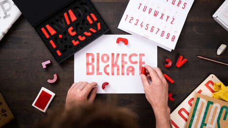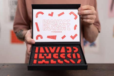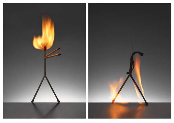
Andreas Scheiger is back at it again, this time with his Evolution of Type, Exhibits 6-9 & 12 photo series. Continuing his endeavor to dissect the entire alphabet, he has created some new letters to examine: V, T, B, N and X.
With the unwavering belief that a letter and sign must have an organic origin in order to suggest a sound and thus, a word, the Evolution of Type, Exhibits 6-9 & 12 photo series delves into this hypothesis even further. Thus far, it looks as though he's proving himself right. What do you think?
Key Themes Behind This Trend
- Organic Type Designs
- Exploring the concept that a letter and sign must have an organic origin in order to suggest a sound and thus, a word, creates opportunities for designers to revolutionize the traditional approach to typography and create more organic designs.
- Alphabet Dissection
- Continuing the endeavor to dissect the entire alphabet, this trend opens up possibilities for new interpretations and forms of letters to be created.
- Sound-inspired Typography
- By basing type designs on the sounds created by organic origins, designers have the opportunity to create a new form of typography that is rooted in sound and language.
Where This Applies
- Graphic Design
- Graphic designers can explore new possibilities in typography by incorporating organic origins and sound into their designs.
- Printing and Publishing
- The trend of organic typography creates an opportunity for the printing and publishing industries to offer a new type of printing that prioritizes organic and sound-inspired forms.
- Branding and Marketing
- Companies can utilize sound-inspired typography in their branding and marketing strategies to create a deeper connection and emotional response with their audience.