


Simple Branding Identities Like The Pressery Always Stand Out the Most
Farida Helmy — July 20, 2014 — Lifestyle
References: timjarvis & inspirationhut.net
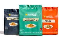
It's been proven time and time again that simple branding identities and packaging designs always seem to be the most successful. For some reason, clean and understated visual branding gives consumers more confidence in the product's quality.
One excellent example of simple branding identities and packaging designs done beautifully is The Pressery. The Pressery is a brand that was born from the love of whole foods and their health benefits -- and it really shows in their design because they keep it clean and neutral with all the focus going to the product itself. The designer Tim Jarvis decided to go with complete minimalism to accurately reflect the pure values of this unique hand-made product.
"Given space to breathe, the logotype always appears adequately padded by a sizable negative space square; a visual metaphor that nothing is allowed to compromise the absolute simplicity and purity of the product," says Jarvis.
Trend Themes
1. Simple Branding - Emphasizing clean and understated visual branding to instill confidence in product quality.
2. Minimalist Packaging - Using minimalist packaging designs to let the product stand out and convey purity.
3. Pure Values - Highlighting the importance of emphasizing simplicity and purity in brand identity and product design.
Industry Implications
1. Food and Beverage - Applying minimalist branding and packaging in the food and beverage industry can create a sense of trust and quality for consumers.
2. Health and Wellness - In the health and wellness industry, emphasizing pure values and minimalist branding can enhance the perception of natural and healthy products.
3. Artisanal Products - For artisanal products, minimalist branding and packaging designs can help convey their handmade and high-quality nature.
5.7
Score
Popularity
Activity
Freshness