


The Silver Hills Redesigned Bread Packaging is Super Cute
Robyn Currie — November 13, 2009 — Lifestyle
References: karacters & designyearbook.blogspot
You know it is a good day in the world when marketers get their hands on our bread and try to make it more hip. I can’t blame them for wanting to, especially after seeing the Silver Hills redesigned bread packaging.
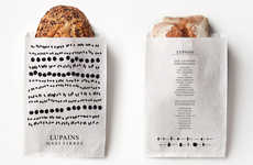
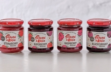
Bringing the packaging back to what the company is, a simple, authentic, fun company that creates great bread, the Silver Hills redesigned bread packaging boasts bright colors. Plus each variety of bread has its own super cute illustration on the front -- almost a caricature of the bread itself. All the rad work was done by the Karacters Design Group.
Bringing the packaging back to what the company is, a simple, authentic, fun company that creates great bread, the Silver Hills redesigned bread packaging boasts bright colors. Plus each variety of bread has its own super cute illustration on the front -- almost a caricature of the bread itself. All the rad work was done by the Karacters Design Group.
Trend Themes
-
Colorful Packaging Design — Exploring innovative and eye-catching designs for product packaging to attract customers.
-
Illustrated Branding — Incorporating unique and playful illustrations to enhance brand identity and create a memorable visual experience.
-
Authentic and Fun Branding — Emphasizing authenticity and creating a sense of fun in branding to resonate with consumers.
Industry Implications
-
Food Packaging — Leveraging creative and vibrant packaging designs to stand out in the competitive food packaging industry.
-
Graphic Design — Utilizing illustrations and visual elements to create captivating branding materials in the graphic design industry.
-
Artisanal Food Products — Implementing authentic and fun branding strategies to differentiate artisanal food products and appeal to health-conscious consumers.
3.1
Score
Popularity
Activity
Freshness