


The Boca Negra Bottles are Masculine and Artistic
Armida Ascano — February 25, 2012 — Lifestyle
References: mfutura.mx & lovelypackage
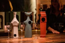
The Boca Negra beer branding by Mexico-based graphic designer Manifiesto Futura takes the well-known idea of making alcohol more masculine and executes it with elegance and subtlety. In an age where most booze branding initiatives involve half-naked women and hyper-manly spokespeople, the approach taken by this alcohol manufacturer is truly refreshing.
Masculine in a way that is not by any means alienating to women, Boca Negra packaging expresses its boyishness through art; namely, through expert typography. The bold lettering on the predominantly black bottle is done in stark white, showcasing bold contrast that is difficult to ignore. This makes the bottle all the more attractive, enticing beer lovers to find out whether the alcoholic nectar in this bottle is as strong and robust as its packaging.
Masculine in a way that is not by any means alienating to women, Boca Negra packaging expresses its boyishness through art; namely, through expert typography. The bold lettering on the predominantly black bottle is done in stark white, showcasing bold contrast that is difficult to ignore. This makes the bottle all the more attractive, enticing beer lovers to find out whether the alcoholic nectar in this bottle is as strong and robust as its packaging.
Trend Themes
1. Artistic Alcohol Branding - Disruptive innovation opportunity: Explore artistic and visually appealing branding strategies for alcoholic beverages to stand out in a saturated market.
2. Elegant Typography in Packaging - Disruptive innovation opportunity: Utilize expert typography and bold contrast in packaging design to create a visually striking and memorable product.
3. Gender-inclusive Booze Branding - Disruptive innovation opportunity: Challenge traditional gender stereotypes in alcohol branding by creating inclusive and appealing packaging that appeals to both genders.
Industry Implications
1. Alcoholic Beverage Packaging - Disruptive innovation opportunity: Develop innovative packaging solutions that enhance the visual appeal and marketability of alcoholic beverages.
2. Graphic Design - Disruptive innovation opportunity: Push the boundaries of graphic design in the branding and packaging of consumer products, particularly in the alcoholic beverage industry.
3. Alcohol Marketing - Disruptive innovation opportunity: Embrace alternative marketing strategies that challenge conventional norms and appeal to a wider range of consumers in the alcohol industry.
3.4
Score
Popularity
Activity
Freshness