


The Babees Pure Organic Honey Gets a Makeover by Ah&Oh
Meghan Young — December 30, 2010 — Lifestyle
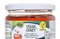
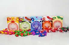
Although the new look for Babees Pure Organic Honey may just be a concept at the moment, it is still one to remark on. Not only is it absolutely adorable, it is also incredibly well executed from branding to packaging.
Conceived by Poland-based Ah&Oh Studio, Babees Pure Organic Honey identity concept features a bumblebee aesthetic that is entirely appropriate. The custom-made, hand calligraphy logo softens the geometric look of the packaging. According to the studio, "Through this project we tried to encourage kids to reach for honey instead of refined sugar."
Conceived by Poland-based Ah&Oh Studio, Babees Pure Organic Honey identity concept features a bumblebee aesthetic that is entirely appropriate. The custom-made, hand calligraphy logo softens the geometric look of the packaging. According to the studio, "Through this project we tried to encourage kids to reach for honey instead of refined sugar."
Trend Themes
1. Eco-friendly Packaging - Ah&Oh's concept for Babees Pure Organic Honey showcases an environmentally conscious approach to packaging with its soft and adorable design.
2. Customized Calligraphy - The elegant hand calligraphy used on Babees Pure Organic Honey packaging suggests the potential for personalized and unique branding opportunities in products.
3. Child-centric Design - Through the kid-friendly bumblebee theme, Ah&Oh has tapped into the possibility of designing packaging that appeals directly to children with the goal of promoting healthier eating habits.
Industry Implications
1. Food and Beverage - Ah&Oh's honey packaging concept highlights the potential for creative and eye-catching branding in the Food and Beverage industry while also promoting healthful eating choices.
2. Art and Design - Ah&Oh's signature calligraphy and attention to detail in the Babees Pure Organic Honey packaging serves as an example of how the Art and Design industry can integrate personalization into their branding and packaging efforts.
3. Children's Products - Ah&Oh's packaging approach presents a new opportunity for companies within the Children's Products industry to create fun and engaging designs that encourage children to pursue healthy food choices.
3.2
Score
Popularity
Activity
Freshness