


Italio Kitchen Branding Exudes Simplicity and Freshness Like the Food
Amelia Roblin — October 12, 2013 — Marketing
References: pushhere & thedieline
It isn't true that it's just the larger and more upscale businesses that have stronger branding strategies, for this charming fast-casual restaurant has launched a totally endearing new look. Italio Kitchen branding is simple and iconic and it goes a long way to stamping a good and strong impression on all of its clientele.
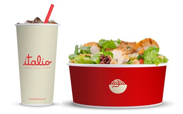
The Italian restaurant provides quality food with an informal atmosphere, so it required a refresher to its packaging. Push studio of Orlando, Florida took up the task of animating the establishment's image with a bold cream and red color scheme and a collection of adorable symbols to represent its signature dishes.
A bowl of pasta, salad and a wrap are represented on the corresponding paper plates. Italio Kitchen branding is complete with the sweet cursive spelling of the place's name for a direct and recognizable image.
3.5
Score
Popularity
Activity
Freshness