


Oleg Tarasov 'Not Strong Mark' Changes Popular Brands into Comic Sans Creations
Nikki Taylor — October 10, 2012 — Art & Design
References: behance.net & designtaxi
Fans of typography will probably more than understand the enjoyment of mucking up poplar logo text by switching the fonts like in the Oleg Tarasov 'Not Strong Mark' artwork.
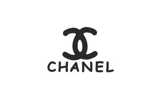
Tarasov manipulates popular brand name signs by switching their desired script to Comic Sans. Such a small change actually does wonders to distorting the overall feel that the brand names are trying to convey. In Comic Sans, Chanel just doesn't carry the same sophistication that the bold block letters embody. The Lexus sign is almost laughable. It lacks refinement and resembles a scribbled cartoon drawing done by a rushed graphic artist.
The Oleg Tarasov Not Strong Mark series provides insight into just how important spending the extra time to fuss over font choice is for big companies.
0.3
Score
Popularity
Activity
Freshness